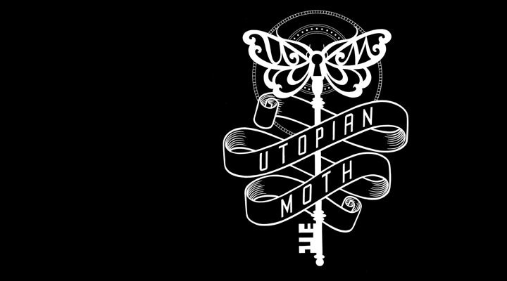
I think just about every kid that goes through art at school has to do at least one stipple or "dot render" exercise - oy vey! So, silly me just spent the last two days revisiting those days - I undertook a new illustration to maybe use on a shirt to print, or new tattoo business cards. While a lot of illustrators use this technique to create a whole composition, laying all shades and contours in dot form of varying densities, I instead still used a strong contour line to maintain the "tattoo" style paired with stippling as a form of shading.
I used a heavyweight opaque fineliner paper and just one Artline fineliner (0.3) to do the stippling. Some people use technical pens of different sizes to vary the tone and detail. I wasn't necessarily looking to create as much realism as you see in this type of work - for this illustration it was more about adding "body" to the forms by still using a pen but without resorting to hatching. One of the most successful contemporary illustrators using this technique is Kevin Sprouls. Hired by The Wall Street Journal in 1979, Sprouls helped introduce the "hedcut" form of image reproduction to print media - even at a small size, stipple rendered portraits as seen in the Journal are generally more legible than photographs of the same size. A number of illustrators now make a good living off the artform which has a very classical feel, often emulating engraving or woodcut newspaper printing.
 |
| Kevin Sprouls, "Frank Lloyd Wright" |
The Queen portrait and little chick just above were drawn by Noli Novak. Her work is amazing too - check out her website which shows more of her portraits of humans and animals.
Virgil Finlay was an American fantasy artist whose work was heavily published in the pulp-fiction magazines of the 1930's to the 1960's. He worked in mainly pen and ink AND scratchboard, often in the same image, using hatching and stippling to shade. These are some of the most labour intensive drawings going around! He's work is worth studying due to his wonderful rendering of the human form, dramatic composition and lighting effects, and fanciful imagination. There are some published volumes of his work out there (now very collectible.) I think I will have to track one down, as digital scans don't quite do his work justice, especially at screen resolution. I found that the scan I took of my own drawing failed to transfer the delicacy of my dots - what looks tiny and round on paper looks a bit rough in pixel form, and I need to experiment with this.
But back to now....I did just pick up the 2007 publication on Usugrow's work - "Love Hate From JP" - featuring a fair whack of his pen and ink works. The Japanese-born artist mixes Asian imagery with that of the Mexican "cholo" graffiti you see in LA, using the heavy calligraphic line work that a lot of us tattooists identify with, while shading in stipple style. Not surprisingly, it's bold and perfect for printing, and he has supplied a lot of work for skate brands. He uses Rotring drafting pens on large sized paper, and you can see his stipple is finer for it, each piece taking a few weeks to execute. If you see this book on your travels, it's worth picking up if you love this type of black and white work. He also has a blog to follow what he is up to.
I'm not sure I'll be hurrying onto to the next stipple illustration - it really is exhausting work and my eyes felt like they were hanging out of my head after it! But it's a technique I've always been drawn to and I'm sure it will lure me back in....


